Brand Studio
Pick a seed colour and a mood. Get a palette, type pairing and monogram with every contrast ratio checked.
Working prototype. Palettes come from colour-theory rules, not from an AI model. The colour psychology score is an estimate of how closely the hues fit a goal, and the page says that colour meanings are tendencies, not rules. Everything, including a logo you upload, stays in your browser. The only outside request is Google Fonts for the typefaces.
01Project overview
A brand-identity tool in one HTML page. Choose a seed colour and one of five moods to get a five-colour palette, a font pairing and a monogram, then check how well the colours fit a brand goal, recolour your own logo and export the tokens.
Key features
- Five moods (Serene, Luxe, Bold, Playful, Heritage), each built on a different colour harmony
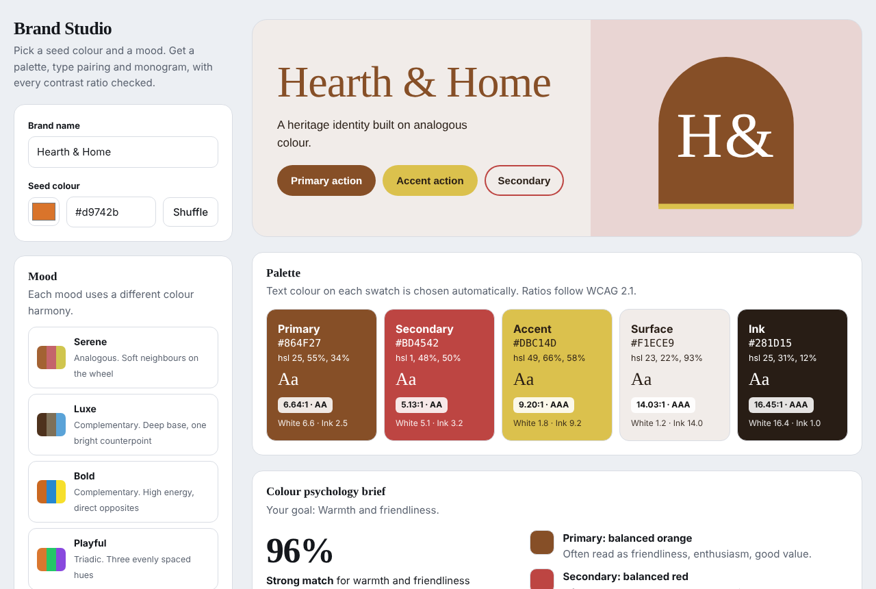
- Five-colour palette with the text colour on each swatch chosen automatically and its WCAG contrast ratio shown
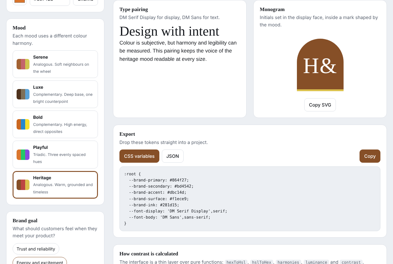
- Type pairing per mood, and a monogram you can copy as SVG
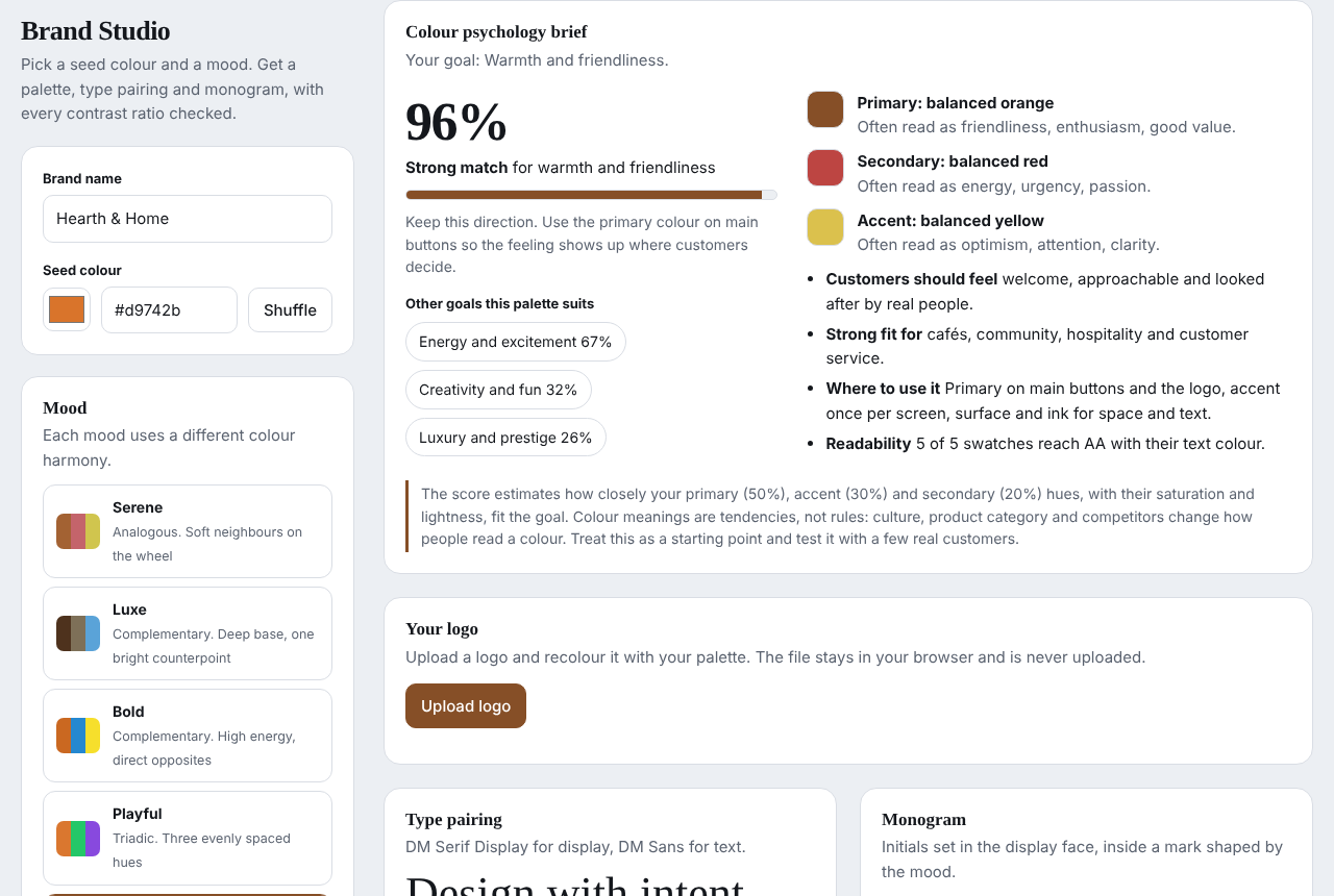
- Colour psychology brief: pick a brand goal and see a match score and how each colour is usually read
- Logo upload with recolouring (match primary hue, single colour or duotone) and optional white-background removal
- Export as CSS variables or JSON, plus a worked contrast calculation for your primary colour
02Problem being solved
Choosing brand colours feels subjective, but harmony and legibility can be measured. The aim was a tool that shows both, so a small business can start from a palette that is readable and fits the feeling it wants.
03Technical architecture
- One self-contained HTML file with plain JavaScript and no framework.
- Pure functions (hexToHsl, hslToHex, harmonies, luminance, contrast) generate palettes and check accessibility; the page is a thin layer over them.
- Contrast follows the WCAG 2.1 relative-luminance formula, with thresholds for AA, AAA and large text.
- Logo recolouring runs on a canvas in the browser, so the image is never uploaded.
Technical documentation
How contrast is calculated
Each sRGB channel is linearised, relative luminance is L = 0.2126 R + 0.7152 G + 0.0722 B, and the ratio is (lighter + 0.05) / (darker + 0.05), from 1:1 to 21:1. Thresholds: 4.5 for AA body text, 7 for AAA, 3 for large text.
Screenshots
Captured from the real page using a fictional brand (Hearth and Home). They were taken where Google Fonts could not load, so text appears in fallback fonts; the live page uses the intended typefaces.
04Technologies used
- HTML
- CSS
- JavaScript
- Canvas
- SVG
- WCAG contrast
- Google Fonts
05Development process
- Started with the colour maths and the five harmonies.
- Added automatic text colours and contrast grading for every swatch.
- Added type pairing, monogram and export, then the colour psychology brief and logo recolouring.
- Replaced the earlier React version in this lab with this standalone page.
06Interactive demonstration
This is the real app, running in your browser. A logo you upload stays on this device and is never sent anywhere.
07Screenshots
08Challenges and solutions
Challenge
A palette can look good and still be unreadable.
Solution
For each swatch the page picks white or the ink colour, whichever gives the higher contrast, and shows the ratio and grade (AAA, AA, AA large or Fail).
Challenge
Colour psychology can sound more certain than it is.
Solution
The score is explained as an estimate from hue, saturation and lightness, and the page states that culture and context change how a colour is read.
Challenge
Recolouring a logo without sending it anywhere.
Solution
The image is drawn to a canvas and recoloured pixel by pixel in the browser; single colour and duotone work best on logos with a transparent background.
09Future improvements
- Test on real phones and tablets
- More moods and harmonies
- Export to more design-token formats
10Source code
Source code is not public yet
This project has no public repository. When one exists, add its URL as repo in data/projects.ts and the link appears here.